MAPPING LEAVES

This is an aerial view of the city of Dubai. I found these views online of various cities around the world. It was quite fascinating and gave me an idea. Why not print these onto photo fabric and use the designs in my mixed media. The leaf is an actual Maple leaf from our yard. I drew the outlines of actual leaves onto the image and tried to place them on areas that would show interesting designs.

The next step was to use my watercolor inks to tint the photo fabric leaf shapes and make them look natural. This surprised me as the result looked like actual leaves.

You can see how the lined images look like markings that could be found on real leaves. The final step was to create veins on the leaves and a stem. I did this with the sewing machine.
PAINTING A MURAL

The first step was to decide on a design. I used an image from one of my quilting books called "Garden Wimsey." I had made this quilt and remembered how cute it was. Since this wall is in a converted monestery that Catholic Charities are going to be using as a safe house for pregnant mothers in crisis, I thought that this would help to cheer up their surroundings. I drew it on contractor's paper and used a 4 ft. X 4 ft. scale. I will repeat this 3 times across a 19 ft. wall. I cut out the shapes and used the negative space as a stencil.

I tacked my paper stencil to the wall, and marked the positive shapes with a water soluble pen. Next step is to paint Gesso on the shapes.

After I painted the shapes with Gesso, Sandra helped me block in color.

Here I am working on the wall. This is an area that connects the play room for this pregnancy crisis safe house to the laundry room. Children will be passing through this hallway with their mothers. I wanted to make this look like it was done by children.


Here are the three motifs that we painted on the wall. This design was borrowed from a quilting book that I have called Garden Wimsey by Mickey DuPree.
PET PORTRAITS
The Snickers Project

This is my daughter's Fox Terrier, Snickers. She is 7 years old and a very smart and feisty dog. I want to do a fabric interpretation of her, but I want it to make her look like she did as a younger dog. I took this photo from Facebook. I like the look on her face.
I turned to the internet to find facts and photos about Fox Terriers. How their fur lays, how the bone structure and muscles look in their face. I found that there are many, many different types of Fox Terriers. I had to find one that looked most like her type. I finally came up with two photos that were of actual drawings. This helped me see more details of the fur. Better than just photos of dogs.

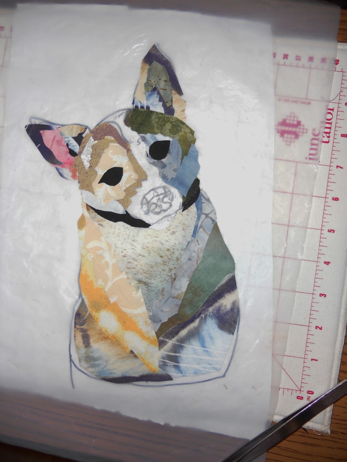
Here are the three photos that I worked from. Snickers in the middle and then artist's depictions of the Smooth Fox Terrier face. Markings will always differ with each dog. The color on Snickers was darker when she was a young dog. She was also more slim. So, I did some trial and error sketches and came up with what I thought was a more youthful version of her.

On the left is a tracing of the main outline from my sketches. It took a lot of trial and error to do the mapping of her facial markings, but I hope that this will be close enough. Using a light table, I traced my map onto freezer paper. I then, spent a lot of time analyzing how the light source would affect my subject. I divided the sections by light, medium and dark sections. Also I tried to label these sections with letters and numbers and warm or cool colors. At this point it looks like a "Paint By Number" mapping. The final mapping is then traced onto a second piece of freezer paper that will be cut apart.

No snippet of fused fabric is ever thown away. I have ironed fusible material (wonder under) to the backs of larger fabric pieces, as I have worked on various projects over the years. Since this fusible never goes bad, I can repurpose them into new projects with ease. Especially small projects like "Snickers." All you do is cut the desired shape and lay it on your foundation; and then heat with the iron. I really like having these choices. So, the sorting into piles is determined by the project. I usually sort by color intensity color value. Not always color hue. In other words; darks, lights and mediums of color. The same way I work in paints.

From chaos, comes order. This will be my pallet. Notice that the containers with mediums are full but the containers with very light and very dark fabrics are not. This is the problem that every fiber artist has. The selections of these two extremes in fabric are very sparse. I need to replenish my supply by finding small pieces in my stash of fabrics that I will need to put wonder under on the backs. I do a lot of hand dyeing also. This helps me to come up with the lights, but the very darks are usually going to be commercial fabrics.

Placing a teflon pressing sheet over my drawn image; I can, now,
press my bits and pieces over my diagram. Just like painting by number. This allows me to add or remove pieces that do not seem to work. They just lift off of the presser sheet. My idea is to have a warm and cool side to Snickers. Hopefully, this will help to round her out. Left side ear has warm color.

Cool side ear is now in place and allows me to start working from the bottom up. I will probably be doing a lot of trial and error at this point.

There will be some adjustments as I progress on this. I discarded some choices and made others. You can watch the progression in these next pictures.

So now I will be doing a little threadpainting to make sure everything is anchored down and slightly blended.

So here is the final version. I was very surprised to see how close I came to getting a very true representation of Snickers. Now, I just have to complete the background and finish the piece.
COLORED PENCIL AND INKTENSE PENCIL ON FABRIC

White fabric is ironed onto freezer paper for a foundation to work on. Outline of Dogwood Flower is outlined with pencil. Using a photo of the flower, I use color pencil to form a petal of the flower.

Color, shadow and highlights are used to make this flower take form and show depth. What works in a photo, does not always work in a drawing. You must exaggerate color and detail so that it will look dimensional and vibrant.

For the final details I want a more potent color. This is accomplished by switching from the more subtle colored pencil, to the Inktense pencil. These are actually made with ink. Look at the difference in the depth of shadow and detail lines. It is not as good when used overall, but is excellent as an accent. It will be heat set, and then a spray fixative will be put on it to make it permanent. I will probably use green beads or french knots with embroidery thread for the center. This will eventually be part of a larger work. I entered my finished piece into the Ozark Empire Fair and won 2nd place in the Mixed Media category.
Strip Landscape

Since I am teaching a Landscape Class next year at my quilt club; I decided to start exploring simple designs, that would work well in a class project. I decided to do one that is based on the Oriental Space design. The Oriental art is based on a series of planes. The farthest object from you is placed at the highest level. Then you proceed down with more planes until you reach the bottom; which is the area closest to you. In true Oriental Space, size means nothing. Color intensity means nothing. But in Western Art, we are more used to seeing depth in our perspective, so I am using the Oriental space design with the modern Western influence. Well, maybe. I will make that judgement as I progress. I don't want the students to get overwhelmed.

The strips will be very narrow to suggest that they are in a far distance. I am keeping the pallet with cool colors in the distance. I have added a slight warm tinge to the top of one strip, in order to create interest and to repeat the sunrise colors. This will also help to bring your eye downward from the sun. This is all raw edge, freeform cutting. No fusible is used. The foundation is a piece of linen fabric from an old pair of drapes. It makes a good foundation.

This strip is the dividing point in the Rule Of Thirds. It is one third down from the top. I will now change my pallet to introduce greens into the composition. Also, the strips will be wider because the landscape is getting closer to you.
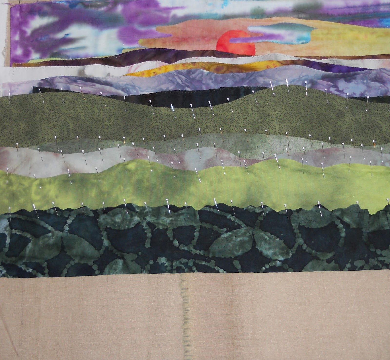
I did some machine applique with a zig zag stitch on the top strips, just because I knew I was not going to change anything and I did not want to push so many layers of pins through the machine without a thousand band aids at my side. The second third of the landscape is now moving downward. The intoduction of greens and some wider strips make you have the feeling that they are closer to you. But...by now you are saying. This is getting boring. You are ready for something to focus on. Right? I went under each strip and cut away some of the bottom, so that there would not be so many layers to sew through.

If you look closely, you can see that along the outside edges I have placed registration marks. I place them at irregular intervals at the beginning, but keep adding the marks as I go down the composition. I measure from the bottom up. I cut my strips to be even along the bottom so that it can be placed on even planes. It doesn't matter how you cut the top curves, but keep your landscape even as you work your way down.

Now we need to discuss shore lines. If you want to add a strip that represents water, make very sure that your shoreline is even. Do not let it run downhill. And it is best to keep your whole composition on level planes. There should be clear contrast at the shoreline. Notice the dark against the light.

And here you have it. The perfect background for any landscape elements. You can put a small boat in it. You can add a tree to one side on the foreground. You can add anything. An animal looking at the distance. Flowers of any kind. Any size will do. But the bigger the focal element, the more illusion of distance it will give. You could go from a foreground flower to the sun in outer space. How is that for perspective dimension? I cut this down to 16 X 20 inches, but it could be any size.
Low Emersion Paper Dyeing
For this experiment I am using Art Papers which are purchased in an art or hobby store.

These papers come in various colors. They are a little stronger than regular paper. You could probably use wrapping paper.

I would suggest a step that I did not use here. Spray the art papers with a water mist before you crush it down into a ball. It would probably soak up the dye more efficiently.

Crush the paper down into a small ball. Insert into a ziplock baggie with about a teaspoon of dye and about half a teaspoon of water.

I am using Rit dyes. They are easy to find and easy to use. Since this is just an experiment. I am not using more expensive dyes.

Scrunch and manipulate the paper until all the dye is absorbed. Open bag and carefully open paper up.

You might want to have extra dye available to use with and eyedropper for more effect and places that need more color. I stood over the papers and dropped it on.

Luckily, it was a warm day without a lot of wind. I layed them on the grass, dropped some extra dye on them and then used a spray bottle to wet down the drops to diffuse them.

You can look at your papers after they dry. On some you will like the front, on some you will like the backs.

The best piece was on tissue paper. However, it is best to skip the water and only use the dye for tissue. It will dissolve and is very fragile. It falls to pieces. The final step is to coat at least one side with a PVA glue. You can also use Elmer's glue. It makes your paper flexible and strong and feel like fabric.

Free Form Cutting From Snow Dyed Fabric

Using scissors, I cut selected spots to freeform cut feathered fabric shapes. A fusible web was applied to the back of the fabric before cutting. When everything looks right, the cuttings are ironed down.

The background is constructed in the same manner and the whole thing is fused to a piece of muslin to be quilted and put into a finished work.
SNOW DYEING

Fabric is soaked for 20 minutes in a washing soda bath. This removes any preservative coating and activates the dyes.

I use professional dyes, but any powdered dye will do. Rit is widely available and others are at hobby stores under various names. In this case, I am using the primary colors of Red, Yellow and Blue.

After testing the color fastness of my plastic grocery bag printing, I scrunch the bags up and lay them on the bottom of my pan. This keeps my fabric from laying in the dye. I wring out my fabric from the soda bath and scrunch it up on top of the bags.

Time to scoop snow into my bucket and the powdered dye is added, usually one teaspoon is enough. I do this with each color or color combination. I mixed Red, Yellow, and Blue to get my rust color.

The mixture resembles that of a snow cone. Once you bring in the snow, it is best to work fast in small batches.

The snow dye mixture is laid onto the scrunched fabric in any order you choose. I take it to the garage and leave it overnight. This allows the snow to melt slowly and penetrate the scrunched fabrics in different layers. In the morning, the fabrics are rinsed until most of the dye is out, and then put into the washing machine with a special washing agent.

Here are some of the results: Flea Market find. Linen collar. I always throw in a scarf or some type of scrappy piece of trim, just for fun.


Snow dyeing is a form of Low Water Immersion that gives you those wonderful highlights and marbled patterns that are so important to art quilters. Some commercial fabrics do a good job of this also, but can be expensive. I use both.
FABRIC PAINTING

Fabric painting can be done with any fabric paint or any artist's acrylic paint. In the case of the acrylic paint, it is best to thin it with textile medium which is available in any hobby store. I am painting on a piece of medium gray fabric and using a small foam brush. I am using the primary colors and black for accent.


After the paint is dry, it is set with a hot iron. This makes the paint permanent and it is ready to use in any project.
NEEDLE FELTING DYED WOOL ROVING

Wool roving is wool that has been cleaned and combed into long fibers. It comes in an assortment of dyed colors including white. White is not a natural color to wool so it is processed as white. It can be bought at hobby stores, but the best roving is bought at yarn shops or on line. I bought these at a yarn shop and they look like and feel like long hair.

There are two ways to make the wool roving into felt. One way is the wet method: using hot water, special soap and continuous manipulation of the wet roving until it opens it's fibers and knits together. Another process is called needle felting. I have a machine that looks just like a sewing machine. It has no thread, but a cradle of 5 barbed needles that punch into the roving in a repeating up and down motion. I first place strands of the roving on a matrix base material and then let the needles do the work, as I slowly move the piece around. Embellishments of yarns and metalic threads and silks and ribbons can be punched in for effect. I make sheets of these to be used in my collage pieces.


SILK TRANSFER DYEING

Our small fiber arts group meets once a month. This month we decided to experiment with the silk transfer process. A white silk scarf is layed out on a piece of muslin. One half of the scarf is covered with pieces of brightly colored and patterned silk. Men's silk ties are great for this process, but they have to be silk, not polyester. The ties should have the end cut off. No points. Remove tags.

The bright red piece of silk that Cheryl is cutting, turned out to be the best piece for this process. It gave the best transfer.

The opposite side of the scarf is then turned over, creating a sandwich with scarf on top, silk pieces in center, and scarf on bottom. Then you begin to carefully roll up the muslin enclosing the scarf in the roll.

Once you have your long roll of muslin/silks/scarf, You tie it off in sections. Your sections should be about 3 inches apart. We used ribbon to tie them tightly. The kind of curling ribbon you use on gifts. Make sure it is tight and won't work loose during the boiling process.

It also helps to trim off some of the excess length of the ribbon ties, to prevent tangels later when it is placed in the water. It will make it easier to clip them off the roll.

We were able to fit 4 scarves into our pot of water. About 2 or 3 tablespoons of cider vinegar was added to the water. Enough water to cover the rolls.

A large brick that has been enclosed in a ziploc bag is placed on top of the rolls to keep them submerged in the water/vinegar bath. Bring to a boil and let it boil for 20 minutes.

My scarf roll is turned out on a towel to cool down before all the ties are removed.
PAINTING WITH SHARPIE PENS ON SILK

Sharpie pens have been around for a long time. This is an experiment using them on a silk scarf, using plain old rubbing alcohol as a difusser. On one side is the flower design with a lot of alcohol sprayed on it. On the other side, I did not use a lot of alcohol.

Here are the two, side by side. The alcohol deconstructs the images for a softer look, but I also like the sharper design. In fact, I would probably just dismiss using the alcohol for most projects. The sharpies can also be used on polyester fabrics and cottons, like tee shirts and tennis shoes and even clothing and canvas bags.

